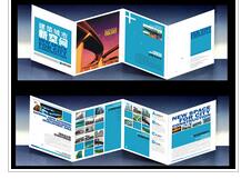
色彩對于平面設計來講,如何運用是尤為重要,一本好的宣傳冊設計離不開文字、圖形、色彩和文案的編排,它們在畫冊設計中重的比重非常大。這其中畫冊設計師對于色彩管理及應用是畫冊設計的非常重要的部分之一,如果一本好的畫冊沒有好的色彩搭配,那么就變的無光,或我們常說的版面太“臟”就是說的這個意思了。
For graphic design, how to use color is particularly important. A good brochure design is inseparable from the arrangement of text, graphics, color and copy. They play a very important role in album design. Among them, the album designer's color management and application is one of the very important parts of album design. If a good album does not have good color matching, it will become dull, or we often say that the layout is too "dirty".
一、在畫冊設計中的許多因素中,色彩是重要的組成部分之一,運用恰當的色彩,可以使畫冊與主題與互應,增強版面的視覺沖擊力,可以使讀者和畫冊所宣傳的產品產生共嗚、強化用戶心理感知力度,留給讀者更深刻的印象,傳達非常真實的產品宣傳效應。
1、 Among many factors in album design, color is one of the important components. The use of appropriate color can make the album and theme correspond with each other, enhance the visual impact of the layout, make the readers and the products advertised by the album have a common sound, strengthen the psychological perception of users, leave a deeper impression on the readers and convey a very real product publicity effect.

二、好的色彩搭配可以使讀者形成整體印象,更好的理解宣傳冊的作用,理想主題。就是需在設計人員在設計宣傳冊的時候,運用顏色要注意整體統一,使其統一要考慮到色彩的色調,飽和度,色相等各類因素,使其顏色能夠視覺統一,讓讀者形成整體宣傳冊視覺統一的感覺。所以設計師要把握好色調的運用。
2、 Good color matching can make readers form an overall impression, better understand the role of the brochure and the ideal theme. When designers design brochures, they should pay attention to the overall unity of colors. In order to make them unified, various factors such as color hue, saturation and color should be taken into account, so that the colors can be visually unified and the readers can form the feeling of visual unity of the overall brochures. Therefore, designers should grasp the use of color.
三、色彩應用與產品相匹配,在宣傳冊的設計過程中,設計師運用產品的固有特性,選擇色彩進行聯想或象征的色彩規定,向用戶傳達商品效果,宣傳冊設計過種中因其產品的不同性質所選用的色彩也不一樣,例如食品類、化妝品類、藥品類等等這些產品的宣傳冊在色彩運用上就有較大的區別,食品類往往是以比較亮的飽和色為主,給人一種干凈、清晰、容易產品味覺、有食欲效果;化妝品的宣傳冊給人較以檔次高的感覺,一般可以分為兩個顏色進行設計,一種是較為飽和的深顏色,給人一種向往的感覺,另一種則是干凈,白白凈凈的感覺,同樣也可以給人一種大氣的感覺。
3、 The color application is matched with the product. In the design process of the brochure, the designer uses the inherent characteristics of the product to select the color for association or symbolic color regulations to convey the commodity effect to the user. In the design of the brochure, the colors selected are also different due to the different properties of the products, such as food, cosmetics The brochures of drugs and other products are quite different in the use of color. Food is often dominated by bright saturated color, which gives people a clean, clear, easy product taste and appetite effect; The brochures of cosmetics give people the feeling of high grade. Generally, they can be divided into two colors for design. One is a relatively saturated dark color, which gives people a yearning feeling, and the other is a clean and white feeling, which can also give people a sense of atmosphere.
四、即要獨特又不要不失行業性質,在宣傳冊的設計過程中,設計師要在可以表達產品信息、構建整體統一的視覺期礎上,還要在運用色彩時不應以市面上的色彩雷同,如果產生雷同用戶可能已經審美疲勞,從而也失去了新的品產興趣,所以在設計宣傳冊的時候,設計應該打破常規色彩運用限制,勇于探索,根據實際內容設計出新穎,具有獨特氣質的宣傳冊顏色色調,使產品在行業中標新立異,有自己獨特的個性。這樣用戶看到產品宣傳冊時就會有新一不一樣的認識,達到良好的視覺效果。
4、 That is, it should be unique without losing the nature of the industry. In the design process of brochures, designers should not use the same colors in the market on the basis of expressing product information and building an overall and unified visual period. If there are similar colors, users may have been tired of beauty review and lost interest in new products, so when designing brochures, The design should break the restrictions on the use of conventional colors, have the courage to explore, and design novel and unique color tones of brochures according to the actual content, so that the products can win the bid in the industry and have their own unique personality. In this way, users will have a new and different understanding when they see the product brochure, so as to achieve good visual effect.
無論是從畫冊設計上還是從其它標志設計、產品手冊設計上,設計公司或設計師都以自己獨特的視覺去衡量客戶產品的定位,設計新來的產品要使顯得特別,不可以和視面上的雷同,那樣就失去了新的設計定位,使產品在市場的競爭中很難決勝。
Whether from album design or other logo design and product manual design, design companies or designers use their own unique vision to measure the positioning of customers' products. The design of new products should be special and should not be the same as that on the surface, which will lose the new design positioning and make it difficult for products to win in the market competition.
