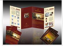
The color treatment of book cover design is an important part of design. Appropriate color expression and artistic treatment can produce eye-catching effect in the reader's vision. The use of color should consider the needs of content, and use different color contrast effects to express different contents and ideas. In contrast to seek unity and coordination, inter color configuration is appropriate, so that the contrast color is unified in the coordination. The color of book title should be used in a certain amount on the cover. If the purity is not enough, it can not produce a remarkable effect. In addition, in addition to painting color used for cover design, can also be used for decorative color performance. The color of the cover design of literature and art books is not necessarily suitable for textbooks, and the cover color of textbooks and theoretical works is not suitable for children's books. We should treat the meaning of color dialectically, not metaphysically.
一般來說設計幼兒刊物的色彩,要針對幼兒嬌嫩、單純、天真、可愛的特點,色調往往處理成高調,減弱各種對比的力度,強調柔和的感覺;女性書刊的色調可以根據女性的特征,選擇溫柔、嫵媚、典雅的色彩系列;體育雜志的色彩則強調刺激、對比、追求色彩的沖擊力;而藝術類雜志的色彩就要求具有豐富的內涵,要有深度,切忌輕浮、媚俗;科普書刊的色彩可以強調神秘感;時裝雜志的色彩要新潮,富有個性;專 業性學術雜志的色彩要端莊、嚴肅、高雅,體現感,不宜強調高純度的色相對比。
Generally speaking, to design the color of children's publications, we should aim at children's delicate, simple, naive and lovely characteristics. The color tone is often treated as high-profile, weakening the strength of various contrasts, and emphasizing the soft feeling. The color of women's publications can choose gentle, charming and elegant color series according to women's characteristics; The colors of sports magazines emphasize stimulation, contrast and pursuit of color impact; the colors of art magazines require rich connotation, depth and avoid frivolity and kitsch; the colors of popular science books and magazines can emphasize mystery; the colors of fashion magazines should be fashionable and full of personality; the colors of popular science books and magazines should be innovative and full of personality; The colors of professional academic magazines should be dignified, serious, elegant, and have a sense of embodiment. It is not appropriate to emphasize the high-purity hue contrast.

色彩配置上除了協調外,還要注意色彩的對比關系,包括色相、純度、明度對比。封面上沒有色相冷暖對比,就會感到缺乏生氣;封面上沒有明度深淺對比,就會感到沉悶而透不過氣來;封面上沒有純度鮮明對比,就會感到古舊和平俗。我們要在封面色彩設計中掌握住明度、純度、色相的關系,同時用這三者關系去認識和尋找封面上產生弊端的緣由,以便提高色彩修養。
In addition to coordination in color configuration, we should also pay attention to the contrast relationship of colors, including hue, purity and lightness. If there is no color contrast on the cover, you will feel lifeless; if there is no light contrast on the cover, you will feel dull and breathless; if there is no clear contrast on the cover, you will feel archaic and peaceful. We should grasp the relationship of lightness, purity and hue in the cover color design, and use these three relationships to understand and find the causes of the defects on the cover, so as to improve the color cultivation.
不難看出顏色對于封面設計而言非常重要。濟南書刊雜志印刷認為要在畫冊封面設計中選擇合適的顏色表現圖書主題,或為封面確定某種基本色調,就需要對畫冊書刊的主題有一定的把握,并對各種顏色的屬性有相當的了解。
It's not hard to see that color is very important for cover design. Jinan book and magazine printing thinks that in order to choose the right color to express the theme of the book in the cover design of the picture album, or to determine a certain basic tone for the cover, we need to have a certain grasp of the theme of the picture album, and have a considerable understanding of the attributes of various colors.
聲明:文章來源于http://www.zhouyingzi.cn/